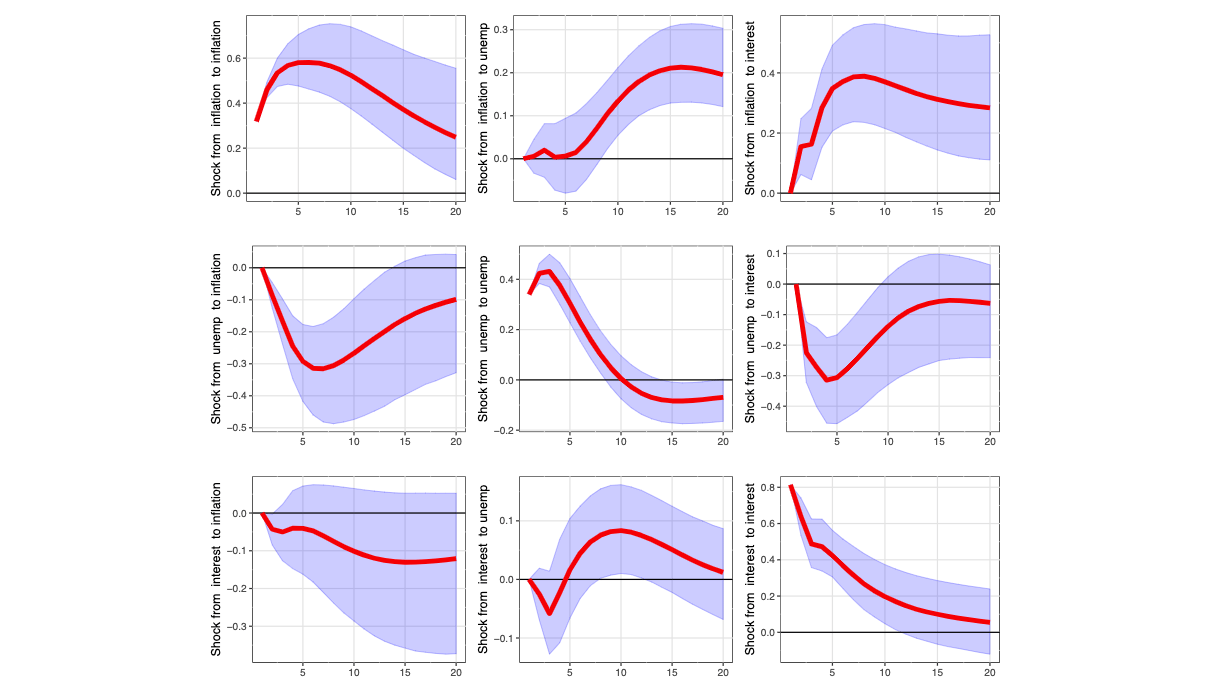
Impulse Response Functions exemplify the insightfulness of proper time-series analysis, showing the expected effect of X on Y over time. Graph by Kevin Kotzé.
Using blockchain network data to predict cryptocurrency price movements—aka “on-chain analysis”—is an exciting new discipline, but the room for improvement is vast.
The main technique of leading on-chain analysts is still eyeballing line graphs.
With years of professional experience in statistical forecasting, I see a massive opportunity to help advance this new field.
If you like the idea, be sure to subscribe. Soon I’ll publish some first examples of statistical on-chain analysis.
The problem
Here is a representative example of what passes for causal inference in the “on-chain” community. Consider the following from CryptoQuant, a popular on-chain data platform.
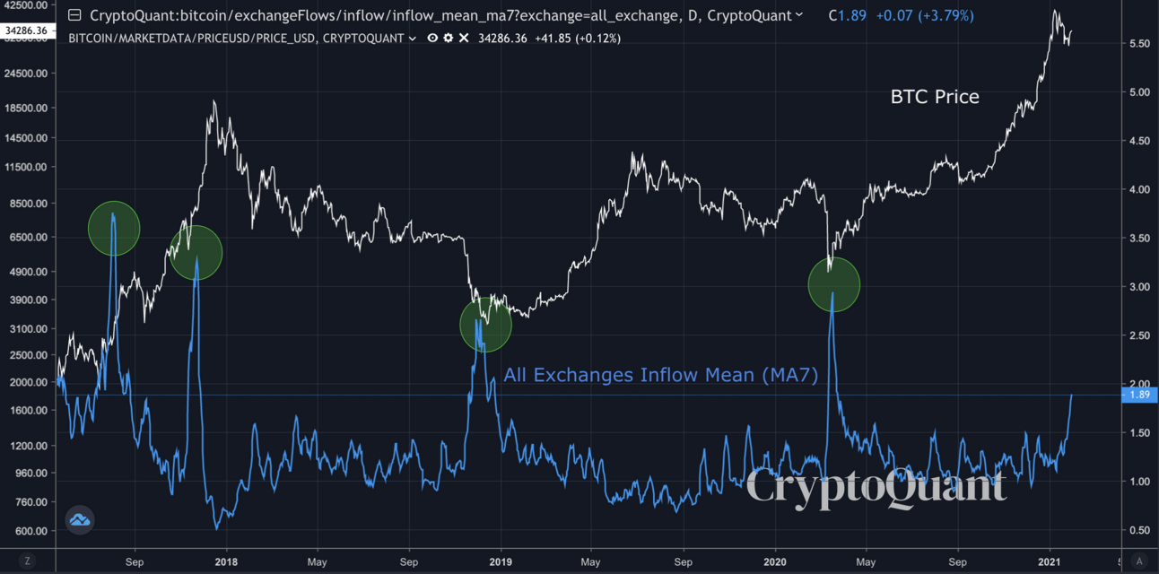
Their Data Guide suggests that the metric “All Exchanges Inflow Mean” (7-day Moving Average) predicts future movement in the BTC price:
Bitcoin price is likely to go up when whales are active in the market in the long term. When this indicator goes below 1 BTC, it means retail investors are involved, and it's likely to be bearish.
This statement seems to propose a causal inference where increases in this variable predict price increases, and drops in this variable below 1 BTC cause price decreases.
The evidence? Just a line graph, with 4 peaks circled.

A pseudo-statistical inference from CryptoQuant.com
Is this really a statistically significant relationship? This kind of eyeballing is child's play. The second peak is temporarily followed by a price increase but then months of price drops. The third peak is actually followed by months of sideways price movement before the price starts to rise. Then if we analyze the second part of the claim, that drops below 1 BTC are bearish (predicting price decreases), it's not at all clear this is a predictive signal. Right before May 2019, this variable drops below zero before a major rally. Immediately after May it's still below zero with a fair amount of rallying afterward. Yes, the price turns bearish thereafter, following on many months of the variable below zero, but this is where eyeballing line graphs breaks down into pareidolia and confirmation bias.
The way forward
What we really want is to make statements like: "When this variable drops below zero, we expect the price to increase by X BTC, with 95% confidence it will between X-low and X-high, starting 1 week later and ending 2 weeks later."
This is what on-chain analysts are groping toward, but you'll never get there by eyeballing line graphs.
We can do better.
The next step forward is statistical modeling of on-chain metrics. The subfield of statistics known as time-series modeling is particularly well suited for generating forecasts from on-chain metrics.
On-chain analysts have advanced many plausible hypotheses, but statistical models are required to test them. Until then, we’re all just guessing.
In a couple future posts, I’m going to apply time-series modeling to the on-chain metrics of the Bitcoin network. This is a fascinating new challenge with potentially extraordinary value.
We’re going to test claims widely believed by the first generation of on-chain analysts, and we’re going to generate forecasts of Bitcoin’s price using statistical methods.
If you’re interested, be sure to subscribe. This is the kind of thing that could easily be its own paid newsletter, but the Other Life blog/newsletter remains free.